The challenge
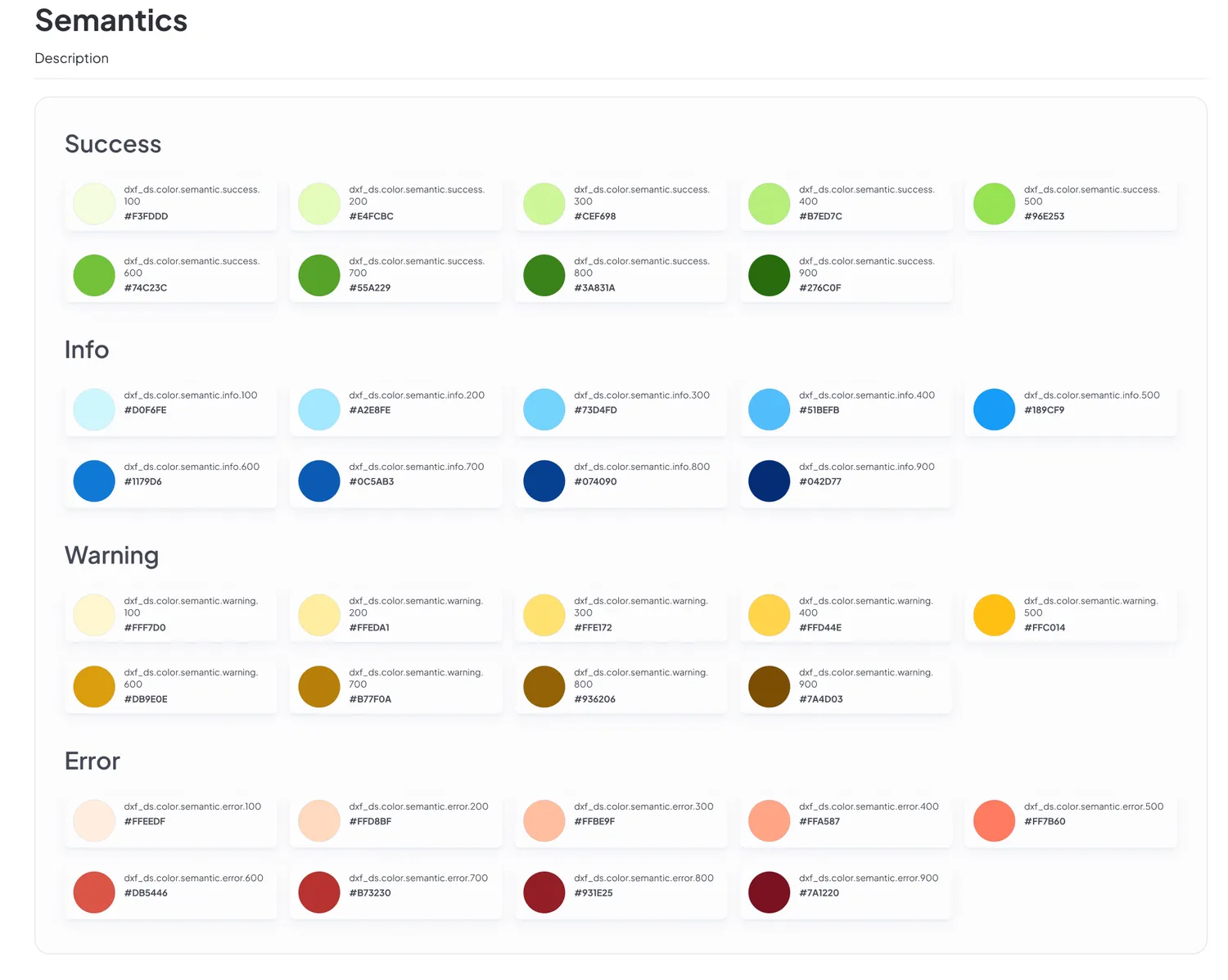
Falabella Retail’s digital products had grown organically, with each team building its own UI patterns, components, and visual language. The result was inconsistency at scale. Three distinct products, no shared foundation. My job was to build one.
The real constraint wasn’t creating components. It was making a single system flexible enough to serve an auto rental catalog, a financial onboarding flow, and a scan-and-pay experience in a physical store. Three contexts. One language.
Process
01 · Define design principles
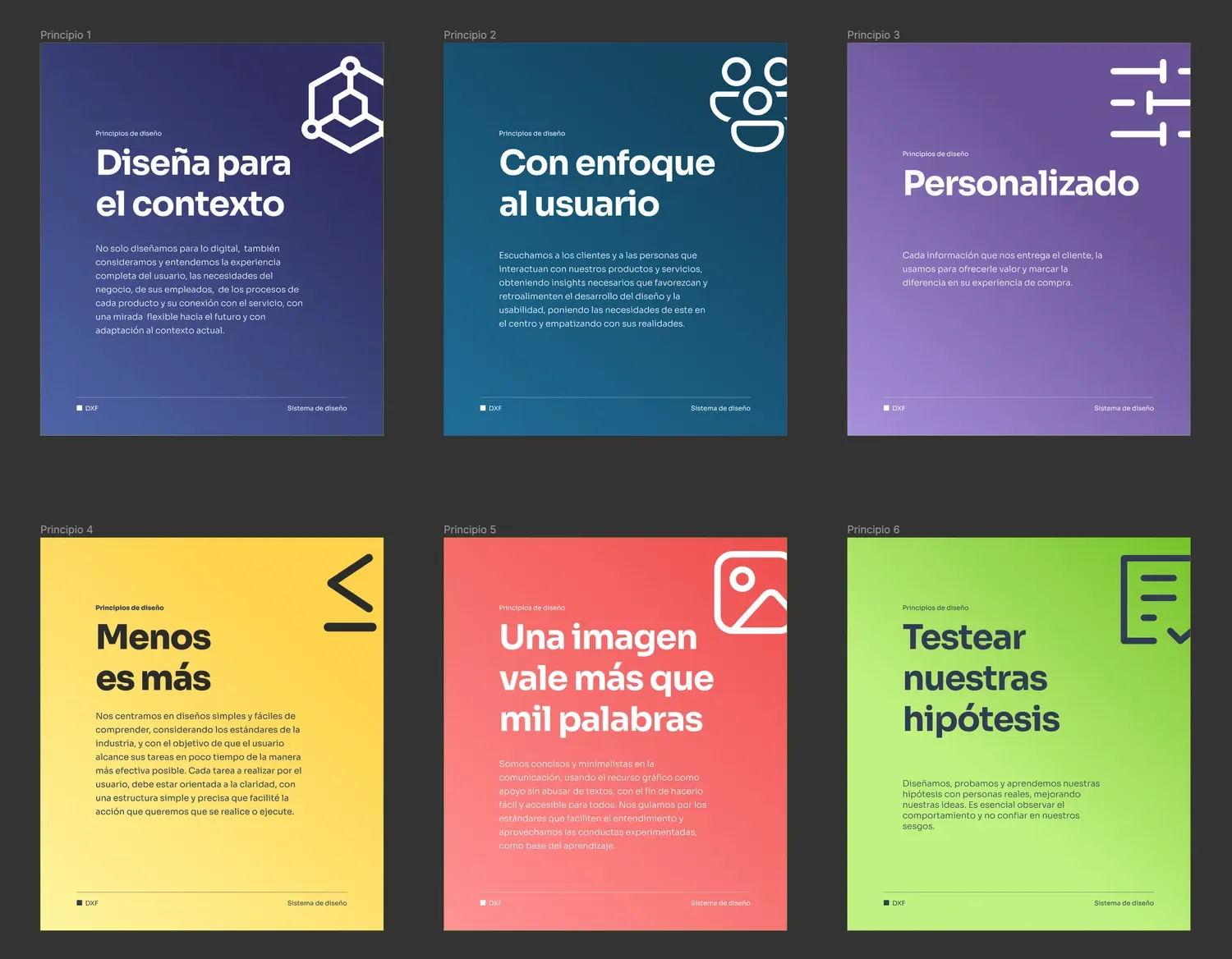
Co-created six principles with stakeholders, covering everything from “design for context” to “test our hypotheses”, to give the team a shared decision-making framework before writing a single spec.
02 · Build the component library
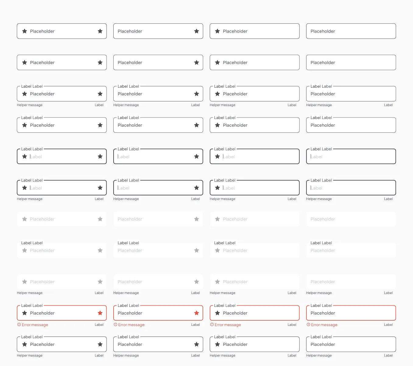
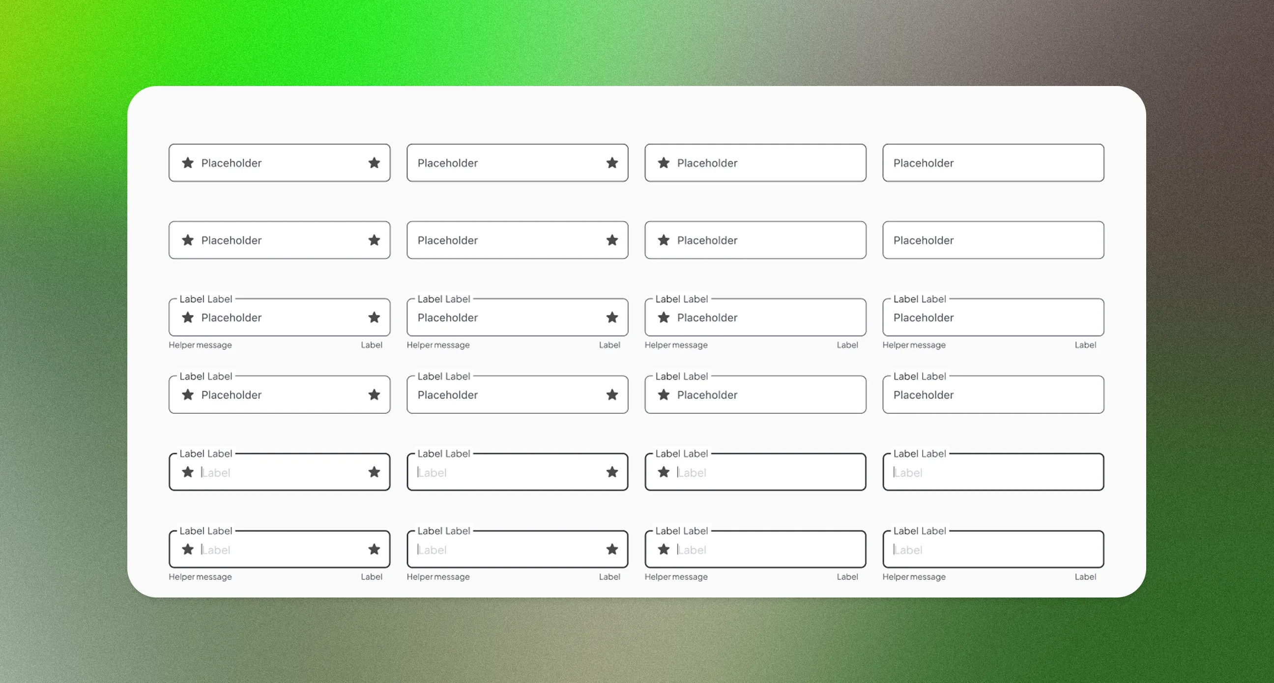
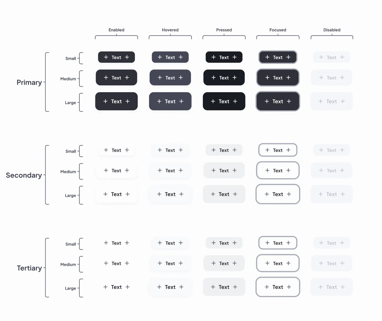
Designed every component with all interactive states (enabled, hovered, pressed, focused, disabled) across primary, secondary, and tertiary variants. No shortcuts on coverage.
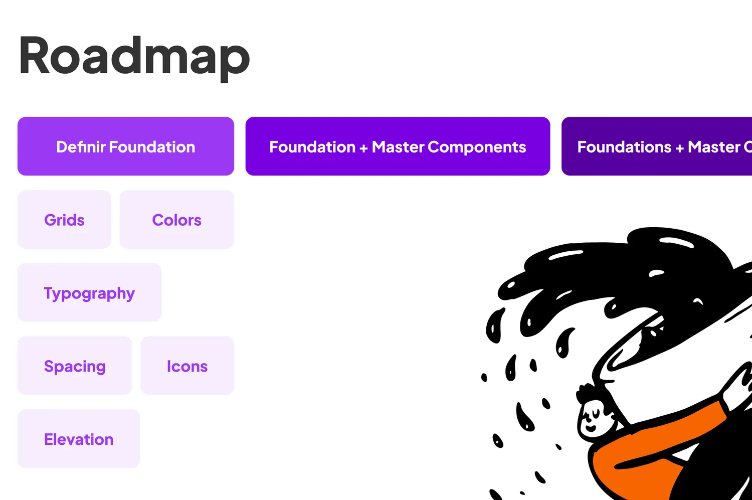
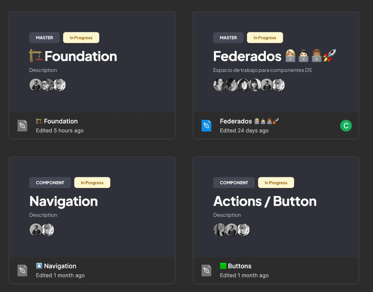
03 · Document for developers
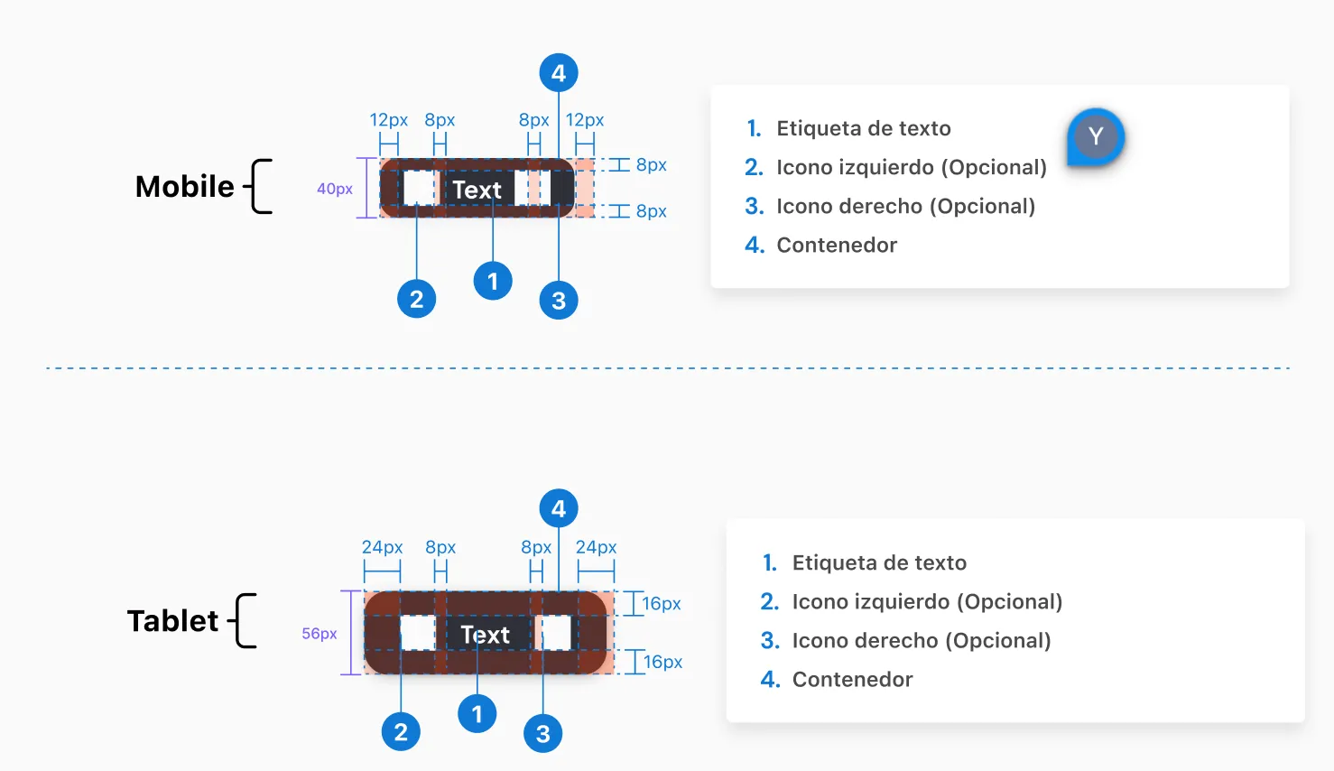
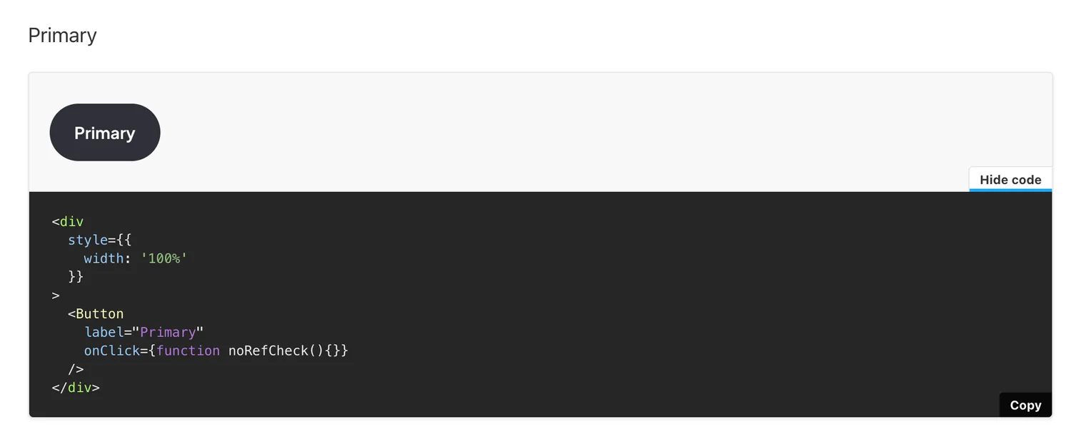
Created redline specs for mobile and tablet breakpoints. The handoff was precise enough that the dev team could implement components in Storybook without back-and-forth.
04 · Ship across three products
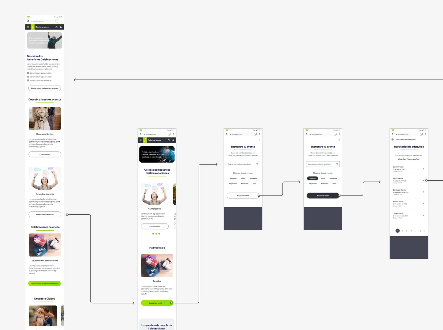
The system was adopted by Renting, Flexit, and Scan & Go. Each had its own team, use case, and visual identity, all built on the same foundation.
Products using the system
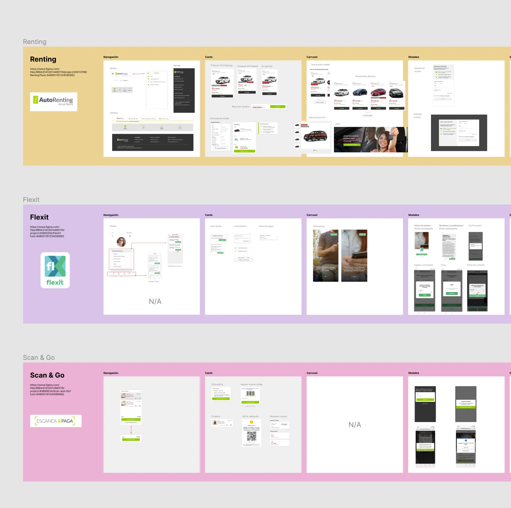
- Renting: Auto rental catalog
- Flexit: Financial product
- Scan & Go: In-store payments
Outcomes
Faster handoff
Redline specs and complete state documentation cut design-to-dev cycles across all three product teams.
Visual consistency
Eliminated inconsistencies across platforms by enforcing a shared component library and documented usage guidelines.
Storybook implementation
Specs were detailed enough for the dev team to build a working Storybook without ongoing designer involvement.
System that scales
A modular approach that let three distinct products coexist under one design language, with room to grow.
Results
Here are some examples of the system in use.